THE CULT OF BLACK AND WHITE
THE CULT OF BLACK AND WHITE
SEPTEMBER 19, 2025
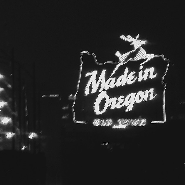

A NEW BLACK AND WHITE IN 2025
I’m still recovering from my recent hard drive disaster, but it has given me yet another excuse to go back into my archives and find some old images to play with. One of the most enjoyable games is to take an old chestnut, an image that worked (at least I thought it did) as a color photograph and see, just for laughs, how it would work as a black and white image.
This can be even more fun if you have lived with the color image for a very long time, and never even imagined it in monochrome. These images I will show you today date from 2009, which is somehow sixteen years ago. While I have converted most of them to black and white over the years, I never considered the cover photograph as a black and white, since the color version seemed to work and reminded me of the dismal night I captured the photo. One of the ways I know I am getting older (and wiser) is to look at an image like this and know that I am no longer that stupid as to stand on the Burnside Bridge in the middle of a thunderstorm, on a December night no less, to pursue my craft.
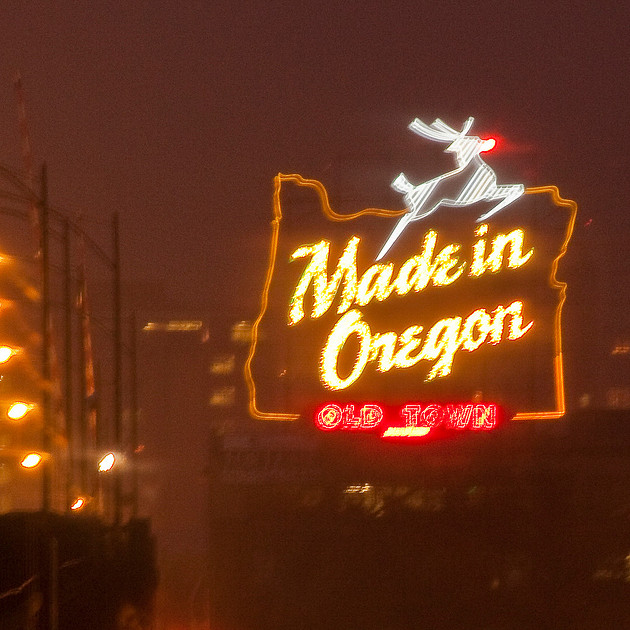
THE ORIGINAL COLOR VERSION, 2009
Recently it has occurred to me that another photographic cult has formed, that of Black and White as the “purest” form of photographic expression, even in the digital age. In a time when black and white film is only available from a refrigerator in the last photo store in town, at prices that rival eggs in New York City, it seems that black and white is entering another golden age.
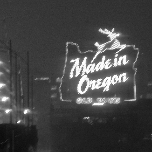
THE INITIAL BLACK AND WHITE CONVERSION, MUCH TOO LIGHT AND BLAND. YOU CAN'T LET THE COMPUTER DO ALL OF THE WORK.
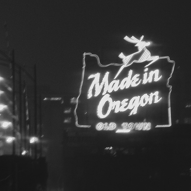
I'VE TAKEN MATTERS INTO MY OWN HANDS BY USING THE "BLACKEST" PRESET, AND THEN FURTHER LOWERING THE BLACK POINT TO ACHIEVE HIGHER CONTRAST. NOW WE HAVE A GRAPHIC IMAGE THAT REFLECTS A HORRIBLE PORTLAND NIGHT.
Now don’t get me wrong. I love black and white imagery, and have always considered it as an important part of my skill set. It takes a lot of practice to master this particular skill of rendering our colorful world in only shades of gray. As a lover of abstract imagery, I have always found it very interesting that most viewers find it much easier to accept a landscape photographic with a black sky than an image of a portion of their world that they don’t instantly recognize.
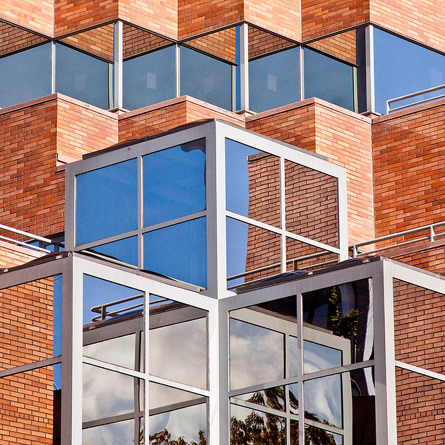
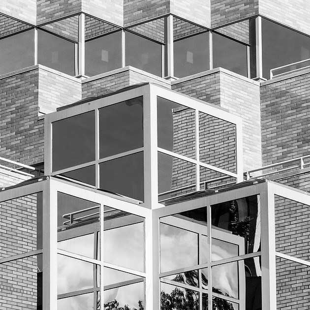
HERE I MISS THE COLOR CONTRAST.
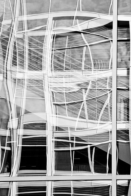
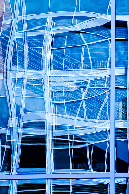
I STILL LIKE MY ORIGINAL WEIRD BLUE COLOR CONTRAST DERIVED FROM A SUBJECTIVE WHITE BALANCE OVER THE STRAIGHT BLACK AND WHITE.
I am old enough to remember the days of film, but I never had the opportunity to delve into the darkroom in any obsessed way, and accepted that photos came in color unless they were in an old Life magazine. When I did try black and white film, I used a “revolutionary” english film that allowed you to give it to the one-hour place just like color film. Of course you then had to spend months trying to track down a place that would deliver black and white rather than purple or brown black and white.

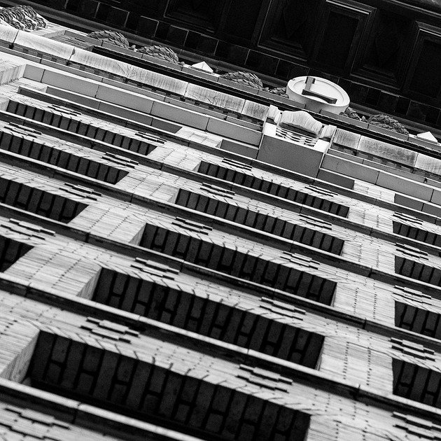
IN THIS PAIR I FEEL THE BLACK AND WHITE IMAGE IS MUCH STRONGER, WITH DEEPER SHADOWS AND MORE DETAIL.
When digital came along, and I finally joined the revolution, I was excited to try converting my digital file into black and white. I mastered that art right about the time that the younger old masters finally admitted that the best sensors and printers and inkjet papers could deliver a “proper” black and white image that deserved a gallery setting. Black and white imagery had followed the road from the only technology, to the hobbyist technology, to the fine art technology, to the dead technology, and now to the latest cult.
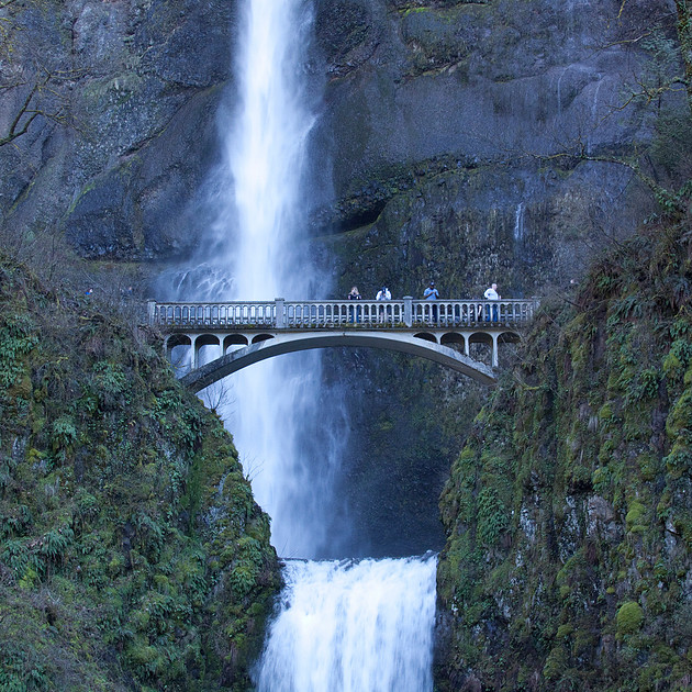
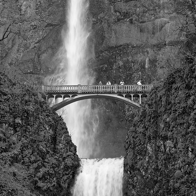
IN THIS CASE I HAVE STRONG FEELINGS IN FAVOR OF THE BLACK AND WHITE VERSION WHICH ELIMINATES THE BLUE CAST COMMON IN WATERFALL ENVIRONMENTS IN THE CASCADES, AND LEAVES THE SNAPSHOT BEHIND.
I say a cult in the sense that there are now very hip, and rich, people who will “only” shoot black and white and look down on color images as mere snapshots, or in today's context, something that should be seen only on an iPhone. Having finally embraced digital, they now spend very many thousands of dollars on advanced cameras that somehow will only shoot black and white images. It’s like buying a convertible car that doesn’t come with a top - that’s why the first convertibles were finally “convertible.” I know that my skills in the digital darkroom allow me to use the color information still present in my digital negative to achieve a much more interesting black and white that I could ever hope to achieve with old fashioned chemistry.
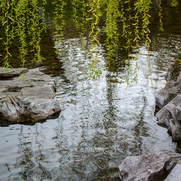
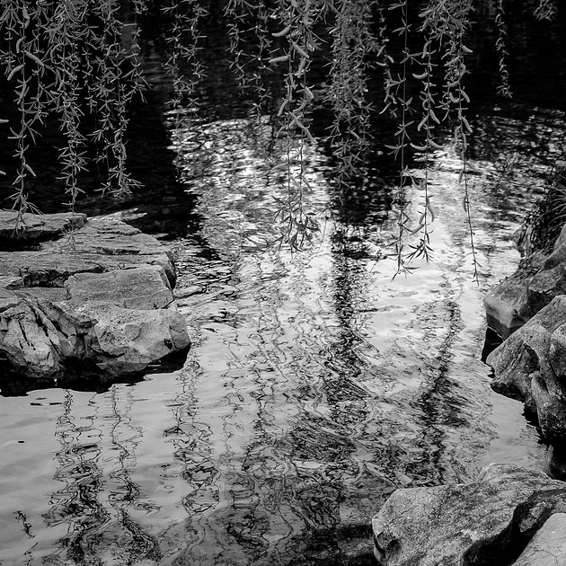
THIS ONE IS CLOSE. I LIKE THE BLACK AND WHITE'S GREATER CONTRAST AND DETAIL.
Some of these image pairs appeal to this viewer as just a matter of taste. I might like either version just because I am more used to it. Sometimes I have a clear preference. It might be as superficial as just not liking those colors, or finding the colors bland or unimportant. Most of my photography is about composition and contrast, and sometimes I find the contrast in monochromatic tones much more compelling than a pair of contrasting colors. As a person who strives for clear and concise imagery, sometimes the best way to “keep it simple” is to eliminate color from the equation.
THE FINAL BLACK AND WHITE VERSION AFTER SHARPENING AND OTHER TYPICAL POST PROCESSING MOVES THAT DELIVER THE STRONG CONTRAST THAT I PREFER. YOU MIGHT DISAGREE.
I embrace black and white imagery as long as you don’t tell me that I can’t have color too. I believe that there is a time and place for both genres, and that while there are images that seem to work better in either, most will work in both. In my experience, most great color photographs, even those that seem to be all about color, can work very well, if differently, as black and white imagery. But that doesn’t mean that you now throw out the color crayons - keep your options open.
